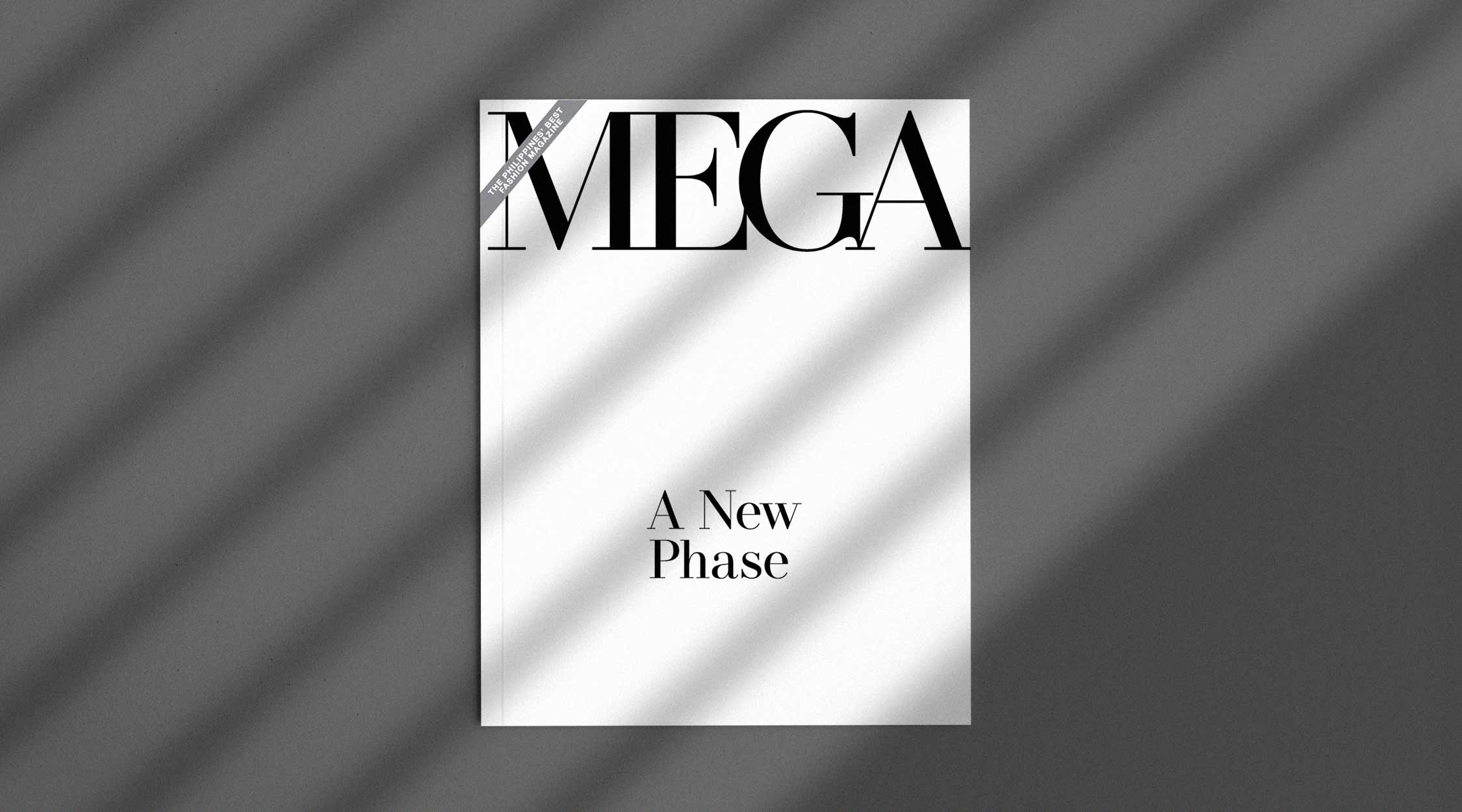
For more than 20 years, MEGA has established its name with its soft-edged serif typeface that we all know and recognize. Today, MEGA has evolved into a sleeker and edgier look—one that has fully matured into its recalibrated core.
RELATED: #MEGAHasChanged: This Is The New Phase Of A Bolder And Braver MEGA
Cliché as it may sound, re-evaluating a brand’s core, let alone changing its visual identity, does create an inevitable ripple effect. Having a new face for MEGA comes with a lot of changes in terms of visual direction, editorial storytelling, and journalism. With our late founder Sari V. Yap’s clear direction of establishing a homegrown media brand of international standards, it has also become very fitting for MEGA to adapt and evolve with the times.

In MEGA’s 28 years of existence, there have been five notable logo evolutions including the latest one. Upon its inception in February 1992, MEGA’s masthead was made up of thick, blocked sans serif letters positioned vertically on the top left corner of the magazine. After a few published issues, MEGA’s masthead transformed into a thinner, italicized version perched horizontally on top of the magazine. At the time, it was essential for most magazines to have their logos placed at the very top of the covers. This is for people to easily recognize and distinguish a publication among many others as you walk past them on bookstores and newsstands.
Come 1994, MEGA evolved into a spaced-out (or socially distant) version of the familiar soft-edged, feminine serif typeface that reflected the brand’s classic and sophisticated personality. Developed by our founding Creative Director Lorraine Belmonte, it was around 1995 to 1996 when MEGA’s masthead had officially transformed into the MEGA we know and grew up with.
“We are witnessing a significant shift as we unveil a new face of MEGA; one that is sleeker and sharper while still maintaining its timeless and sophisticated DNA. But more than the shift in design, this monumental change is also a reflection on MEGA’s new direction for bolder and braver storytelling,” says Associate Creative Director, Jann Pascua. “With this in mind, I had to remodel MEGA’s soft and refined look and carve out a stronger and edgier exterior. I call it the 3S’s—sleek, sharp, and sophisticated—words that best define the new logo as well as what it represents.”
https://www.instagram.com/p/CEszdU9H0B5/?igshid=53c4xk0pmge3
According to MEGA’s VP for Content and Creatives, Suki Salvador, “The new logo is very different from the old logo, which was curvy and had rounded edges. Today, the logo is more modern with sharper edges. It is more confident and sure of itself, which is the same way we perceive the MEGA woman today.”
Another significant but subtle change infused in MEGA’s new logo is the concept of creating connections. It may seem ironic that at a time where we are constantly reminded to observe social distancing, MEGA decided to take the opposite route. Now, all the letters of the logo are linked to one another. “To me, this represents so much more than just typography play,” Jann details. “This enables MEGA to bridge the gap in sharing our point of view to our readers, cultivating new relationships, and championing an abundance of world-class Filipino talents with the use of our platforms. Now more than ever, we are all connected in so many ways than we realize—and that is what MEGA will continue to stand for.”
When asked why the change needed to be done amid a pandemic, Suki says, “So much has changed in the last six months all over the world and it would be irresponsible to give our readers something old. We want something that is straightforward. We want to move in the forward direction and it begins with our identity.”
“This change actually happened a lot sooner than expected,” explains Jann. “There have been plans of undergoing a brand overhaul by the time MEGA will celebrate its third decade as a pillar of fashion, beauty, and lifestyle in the Philippine publishing industry. However, just like what most businesses are going through today, 2020 has become a pivotal year in reassessing and recalibrating the foundations of a brand in order to stay relevant.”
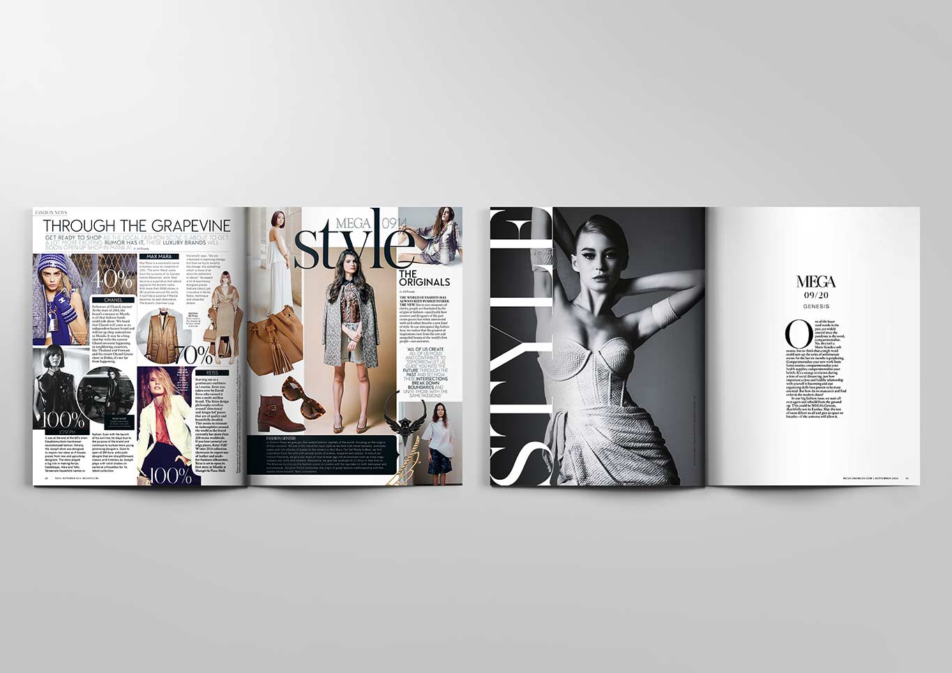
When you flip the pages of the magazine or even browse through our online stories, you may notice a fresh sense of life with its clean, minimalist aesthetic. The dynamic yet well-curated images, and most importantly, thought-provoking stories and aspirational features are timely and relevant–not just for our local readers, but also for global audiences.
This September, readers will notice that the layouts are easier on the eyes. “The team puts a lot of effort into producing high-quality images, so we wanted to make sure those take center stage,” said Suki. “You will also notice that the fonts are larger and easier to read. If you have 2 seconds to read or 10 minutes, there is something for you on every page.”
If you come from a generation that grew up flipping through glossy magazines, cutting up pages for your inspirations and mood boards, then you know how maximalist fashion magazines are back in the day. The more information and images editors can pile on to a single page, the better. What are the latest and hottest trends for the season? You can see it all in one issue. But with the sudden shift in the digital world, where people can instantly access any information they need, magazines became less and less essential. This posed the need for magazines to evolve from what it used to be.
“We had to strip back and dissect the types of stories we will continue to share through our pages while also determining which content will transcend more into our digital platforms,” Jann says. “Little by little, we also had to innovate our visual storytelling by gradually shifting into a more minimalistic approach in layout and design. This way, regardless of what platform you are reading MEGA magazine today—whether it’s still on print or through e-magazines—our stories are just as easy on the eyes as they are compelling. A great layout can make a huge impact to get the attention of readers. For MEGA, it is essential to maintain a clean and contemporary look but can also stand the test of time.”
In spite of these dark and trying times that we’re all facing, MEGA is here to inspire and “be a beacon of hope,” as Nigel from Devil Wears Prada would best say. On the other hand, this is an exciting time for MEGA to be more innovative and to share more compelling stories.
As our VP for Content and Creatives, Suki Salvador would say, “We are no longer a brand that curates products for people to buy. Instead, we provide ideas on how to make their lives better.”
Change is definitely coming and our September issue will not only make a splash, but it will also signify the start of that ripple effect on the bigger waves that MEGA has in store for everyone.