If you thought that the rebranding trend is so 2018, think again. Adding to the list of fashion brands rebranding and changing their logos is Zara.
After Celine controversially dropped the accent from its name by Hedi Slimane and Riccardo Tisci gave a new logo for Burberry, it seems like fast-fashion labels are now joining the club. Zara recently unveiled its updated logo on its website and social media accounts.
RELATED: CELINE Changes Logo And Debuts A New Bag Under Hedi Slimane
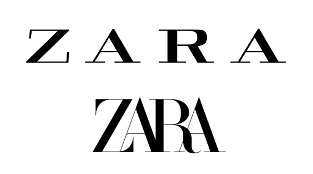
The new logo is designed by the Baron & Baron agency. It is still in an all-caps wordmark, but this time, the label replaced the excess spaces of the old logo creating an overlapping font style. To finish the look, curving accents were added to the letters “Z” and “R”.
However, not everyone seems to be a fan of the change. Consumers are not impressed because having the letters cramped makes it barely legible. Thus, the memes. As for designer and typographer Erik Spiekermann, he called it “the worst piece of type I’ve seen in years.”
Zara have updated their logo. pic.twitter.com/GhhQziNV1D
— fabio •◡• (@fffabs) January 26, 2019
That is the worst piece of type I’ve seen in years. Was this done by one of those new robots that will replace humans?
— Prof. Erik Spiekermann (@espiekermann) January 26, 2019
Getting into the mindset of Zara, they did take the risk to veer away from the minimalist logos. In addition to that, at least the brand didn’t sacrifice their own heritage.
Although, this move seems like a marketing technique. They want to present the label to the market as a brand who’s already in one’s prime in lieu of being associated with other young fast-fashion retailers. But whether this may be beneficial to the business or not, let’s all admit it—the logo could’ve been better.


